v0.8 Alpha 8 - Tables, Multi-Card Editing, and More!

Hello!
It's been awhile since the last time I released an update - sorry about that! I wanted to get this out before 2023 started, but that didn't end up happening... In any case, here's another MasterPlan update! This one brings a few bigger improvements!
NOTE: Please be sure to backup your projects before you update and load them into the next version - better safe than sorry!
Tables!

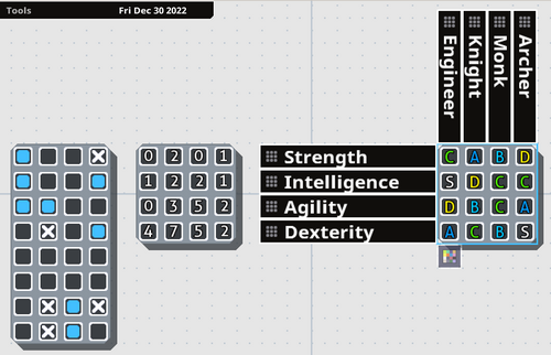
Tables have been re-implemented into MasterPlan! Tables represent grids of information, which can hold one value each. They're primarily useful for repeatable tasks or relative statistics. However, now they're even [i]better[/i] than their previous incarnation.
In v0.7, Tables' row and column names were editable from another screen. Now, all that can be edited right from the project overview. You just double-click on a row or column heading to rename the column or row, and you can click and drag the dotted areas on the headers to rearrange the order. Expanding or shrinking the card adds or removes cards as necessary. Left-clicking cycles through the possible values, while right-clicking cycles in the opposite direction.
Previously, Tables also only worked as checkboxes to indicate repetitive tasks that needed to be completed. Now, Tables have different modes of representing their information, accessible from a menu (the button being visible at the bottom of the Table when it's selected). Rather than just serving as checkboxes, they can also show grades (S, A, B, C, D, E, F), or numbers (going from 0 to 10). This way, you can use tables to cleanly and easily represent a variety of relevant information for your project.
By laying out information in a Table, it makes it simpler to compare and contrast information. For example, in the above example, the right-most table represents a series of stats for four classes (Engineer, Knight, Monk, and Archer). By easily laying this information out in a table, you can see at a glance that the Monk and Knight have no S-rank stats, which might indicate an balancing issue.
Multi-Card Editing

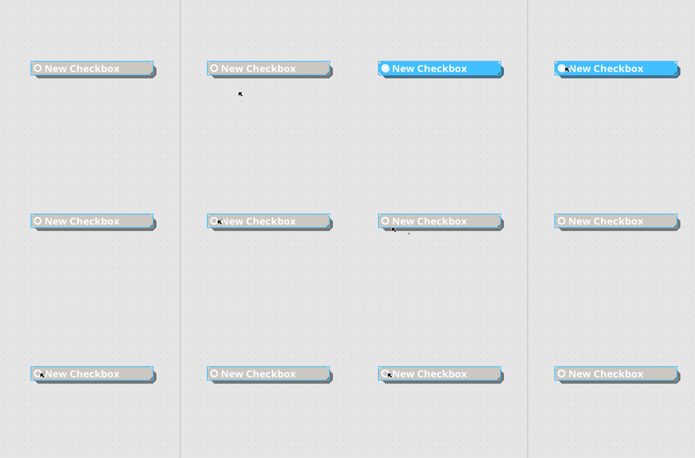
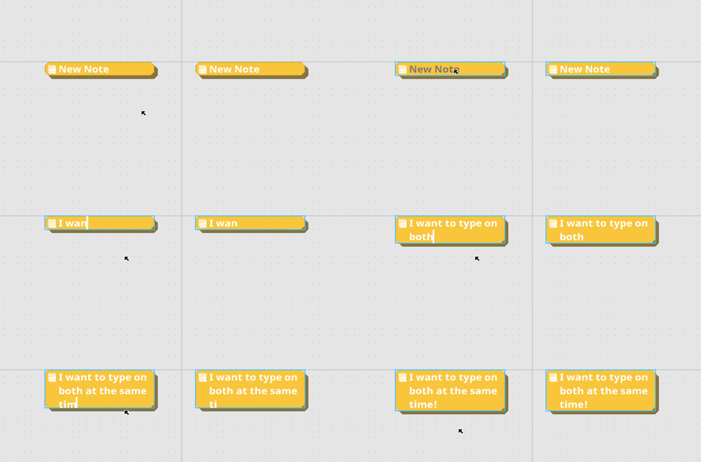
Multiple Cards can now be edited at the same time. This is now as easy as holding the multi-card edit key (left shift, by default), and making the change you want to a card. The same property on other selected cards will also be changed to the same value. So you can, for example, select a group of Checkbox cards and edit them all at the same time, or write some common text on all cards at the same time.

For editable text, hold the multi-edit key and double-click to edit the text. As you type, the text will update on all related, selected cards as well. Note that while this isn't perfect in its current incarnation, it does mean a huge usability boost. I'll keep working on it over time to improve things!
As an aside, while editing text in a card in a stack, you can now press tab or shift+tab (by default) to head to the next or previous card and start editing text there as well.
Text Wrapping Modes
This isn't a huge deal, but I've added a new text wrapping system for writing text in MasterPlan. Previously, when writing text and the text became too long for the card, the card would grow vertically - now you can press a key shortcut (Ctrl+W, by default) or press the text wrapping button to switch the text wrapping mode to Horizontal Overflow mode. In this mode, Cards expand horizontally while typing, only growing vertically when you manually add new lines.
Mac Support
I've looked into M1 Mac support in the meantime between the previous update and this one. I still don't have an M1 Mac, so I have no method to test it myself, but this update may also add support for the M1 chip through Rosetta. Please test out the Mac build if you have an M1 Mac and let me know if it at least boots properly now.
Well, that's it for the big stuff; to follow is the detailed changelog, which is also mirrored in the wiki. Thanks a lot for your support, and I hope to keep working on MasterPlan into 2023!
____
- RE-IMPLEMENTATION: Adding tables back in.
Tables are useful to outline data in a matrix field, represented as an intersection of rows and columns. Rows and columns can be freely resized by clicking and dragging a row or column to rearrange. Double-clicking on the text allows you to edit that text. Tables can be visualized in a few different ways currently: as checkmarks, numbers, or grades (S - F). You can press tab and shift-tab to cycle between editing text for each element.
- QoL: Adding tooltip buttons to help explain unclear settings or options.
- QoL: Adding ability to edit multiple cards at the same time by holding the "Mulitple" key, (aka the "Add to Selection" key, which defaults to left shift).
- When selecting / operating on multiple cards with the left-shift key, a + will appear next to the mouse cursor to indicate this.
- Editing text is done by holding the multi-edit key and double-clicking on the text to edit. All selected cards will have their relevant text field updated by typing.
- QoL: Adding ability to move to next or previous card in stack by pressing "Next Card / Prev. Card" shortcuts (defaulting to Tab or Left Shift+Tab, respectively). Doing this while editing text will move to the next editable text in the next card up or down in the stack.
- QoL: Editing text or collapsing Cards now adjusts the rest of the stack. This isn't perfect, and I still have a lot more I want to do with stacks to improve usability and make them even more fun to work with.
- QoL: Adding a toggle-able text editing wrapping mode. The menu that displays this will appear at the top-right when editing text on a Card. You can press the button or press the keyboard shortcut to toggle between text wrapping modes (Ctrl+W when editing text).
- There are two wrapping modes currently: Wrap, and Expand. Wrap will have cards grow downwards vertically, gaining more lines as you type beyond their borders. Expand will have cards grow horizontally when necessary.
- QoL: Adding name of project to loading prompt when you decide to load a project.
- QoL: Adding setting to change how numbered cards are displayed (either as percentage or current amount out of maximum).
- QoL: Numbered Cards now allow negative numbers.
- QoL: Numbered Cards now allow the current value to surpass the maximum.
- QoL: Highlighting text should be slightly more efficient than previously (though work still remains in this regard, and for optimization in general).
- FIX: Collapsing cards is now properly undo-able.
- FIX: Icons for applying colors to cards no longer change color depending on theme.
- FIX: When render textures are recreated (primarily done on Windows when the window is resized or altered), ensure they are never too small (0x0 in size). This might fix a crashing issue for Windows users.
- FIX: If a path cannot be made relative (on Windows, for example, if a piece of media points to an external drive), the path is saved and loaded unaltered. Note that this change might mean images don't save or load properly between the previous version and this one, so double-check when upgrading to ensure things work properly.
- Contribution by Peter0x44: Improve HOME/END text selection when editing text (previously this would only expand the selection, rather than select from the original position to the caret's new position).
Files
Get MasterPlan
MasterPlan
Visual planning ideaboard, by indie devs, for indie devs and creatives
| Status | In development |
| Category | Tool |
| Author | SolarLune |
| Tags | Game Design, Management, Minimalist, Open Source, planning, productivity |
More posts
- Version 0.9 is Here!72 days ago
- Alpha 8.1 HotfixJan 10, 2023
- v0.8.0 Alpha 7.3 - External Media Cache, Icons, and MoreOct 04, 2022
- Alpha 7.2 UpdateJul 16, 2022
- Alpha 7.1 Hotfix Update!Jul 05, 2022
- Alpha 7 Release!Jul 02, 2022
- 0.8 Alpha 6.1 HotfixMay 02, 2022
- v0.8.0-alpha6 Release!May 01, 2022
- v0.8.0 Alpha 5 Release - Link Cards, and other QoL Improvements!Apr 06, 2022

Leave a comment
Log in with itch.io to leave a comment.